Dev Mahida
Menus
  • Home
  • About Me
  • What I Do
  • Resume
  • Portfolio
  • Blogs
  • Testimonial
  • Contact

Dev Mahida

  • Home
  • About Me
  • What I Do
  • Resume
  • Portfolio
  • Blogs
  • Testimonial
  • Contact

    Welcome

    I'm Dev Mahida

    based in Surat, Gujarat

    Know Me More

    I'm Dev Mahida, a Web Developer

    I’m a passionate Web Developer based in Surat, Gujarat, specializing in building modern, responsive, and user-friendly websites. I love turning ideas into real, functional digital experiences.

    With experience in front-end development, UI structuring, and problem-solving, I enjoy creating clean interfaces and writing efficient code. My goal is to build websites that not only look great but also perform seamlessly across all devices.

    I’m constantly learning new technologies, exploring better development practices, and improving my skills to deliver high-quality work.

    • Name: Dev Mahida
    • Email: devmahidara05@gmail.com
    • Age:
    • From: Surat, Gujarat
    Download Resume

    What I Do?

    Data Analysis

    I analyze data to uncover patterns, trends, and insights that support better decision-making. I enjoy turning raw information into clear, actionable results.

    Web Design

    I create clean, modern, and intuitive website layouts focused on user experience. My designs aim to be visually appealing, easy to navigate, and responsive.

    SEO Optimization

    I optimize websites to improve their search engine ranking, visibility, and loading speed. I focus on clean structure, relevant content, and performance-friendly practices.

    Machine Learning

    I explore machine learning techniques to build predictive models, automate tasks, and solve real-world problems using data-driven approaches.

    Resume

    My Education

    2023 — 2027

    Computer Engineering

    C. K. Pithawala College of Engineering and Technology

    I am pursuing Computer Engineering, gaining knowledge in programming, web technologies, and problem-solving while actively working on real-world projects and developing practical skills through continuous hands-on learning.

    2025 — 2026

    Web development

    Red & White

    I am learning Full Stack Development, covering front-end, back-end, UI fundamentals, and building practical projects that strengthen my experience with modern web technologies and complete application development workflows.

    2022 — 2023

    Higher Secondary Education

    Smt. V. D. Desai (Wadiwala) School

    I completed my HSC with a focus on science and mathematics, building a strong foundation in logical thinking, analytical ability, disciplined study habits, and deep technical curiosity.

    2020 — 2021

    Secondary Education

    Smt. V. D. Desai (Wadiwala) School

    I completed my SSC with consistent academic performance and gradually developed an interest in computers, technology, problem-solving, creativity, and exploring how digital systems work in everyday applications.

    My Skills

    My Work
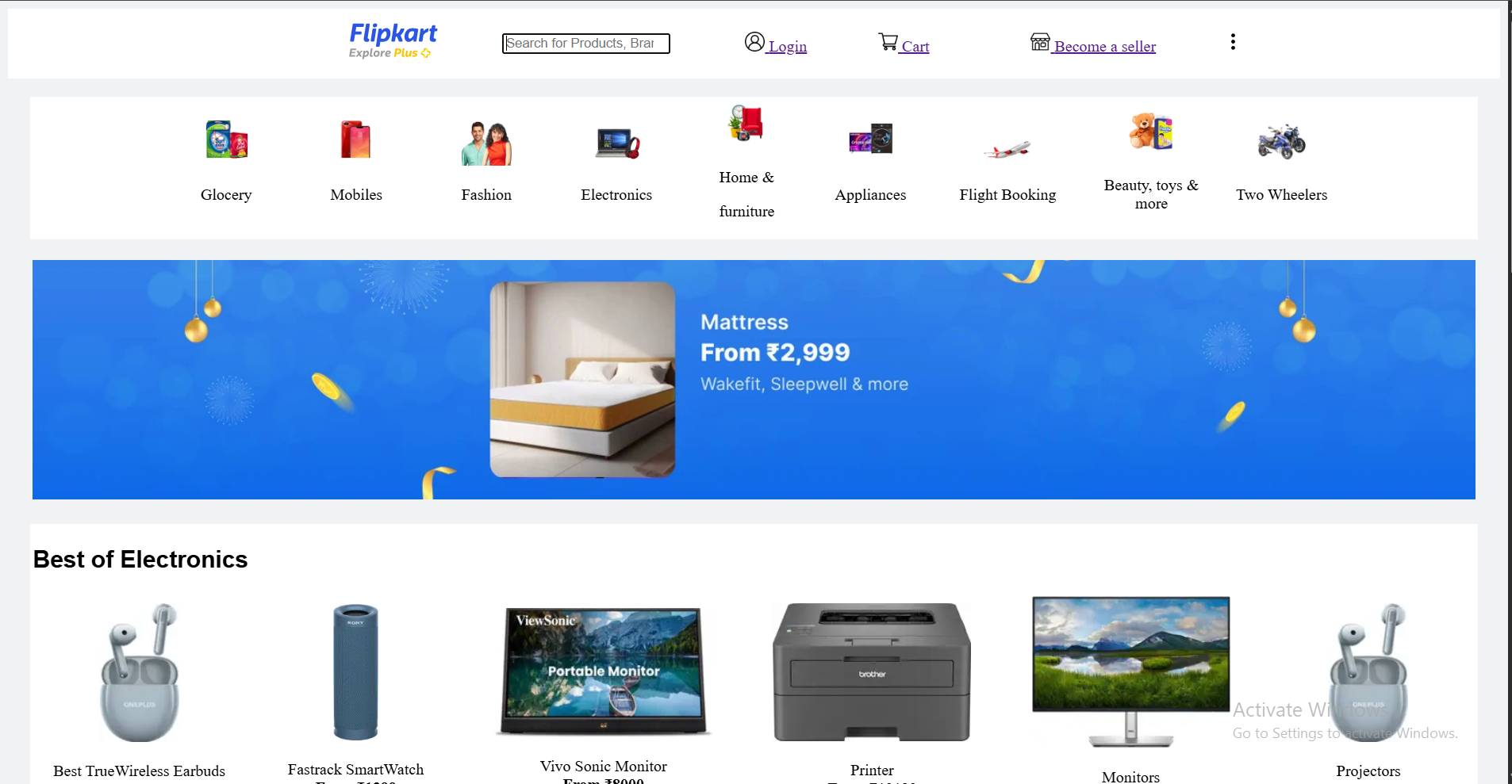
    Flipkart Copy (HTML)
    Casino Website (HTML)
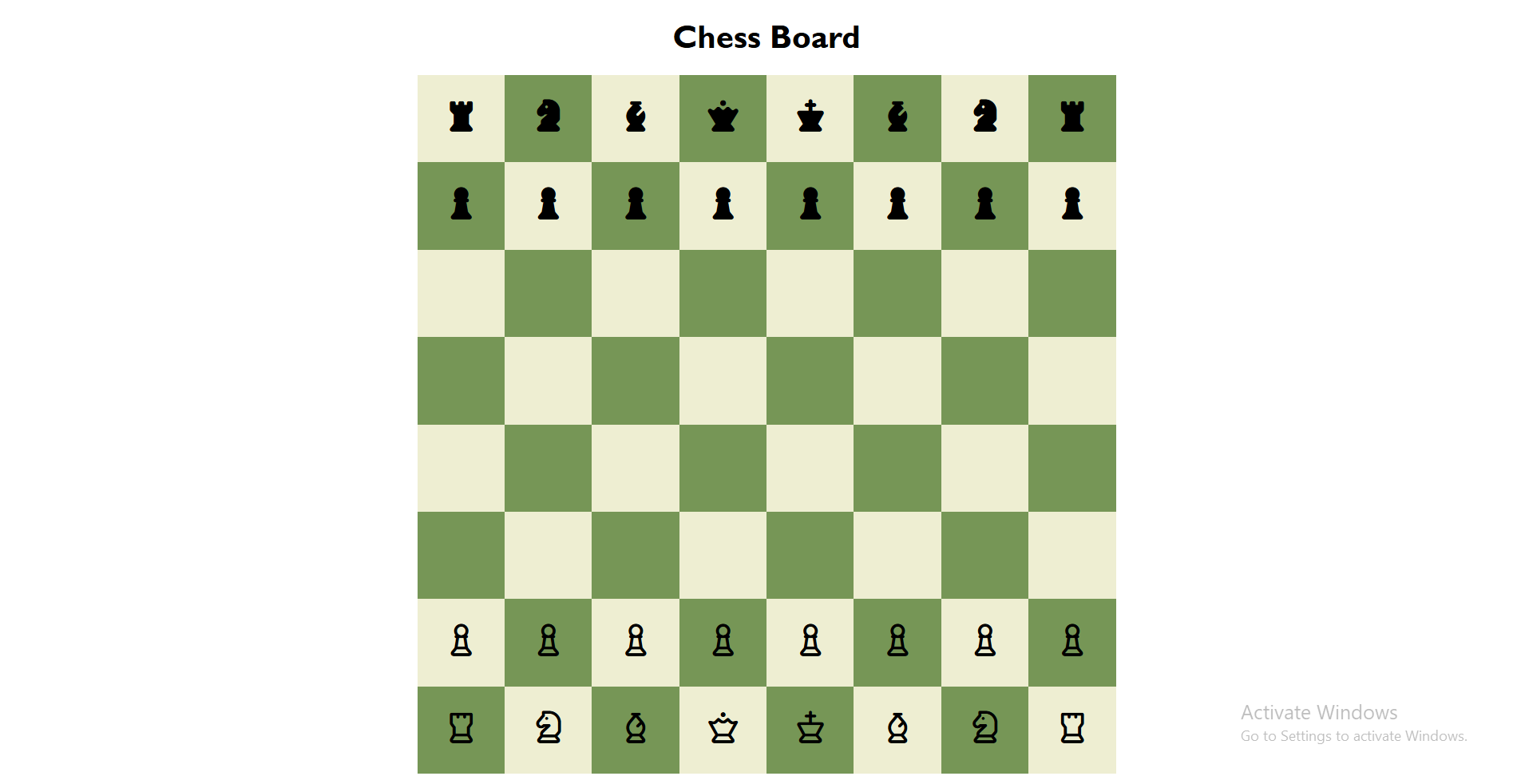
    Chess Board (HTML / CSS)
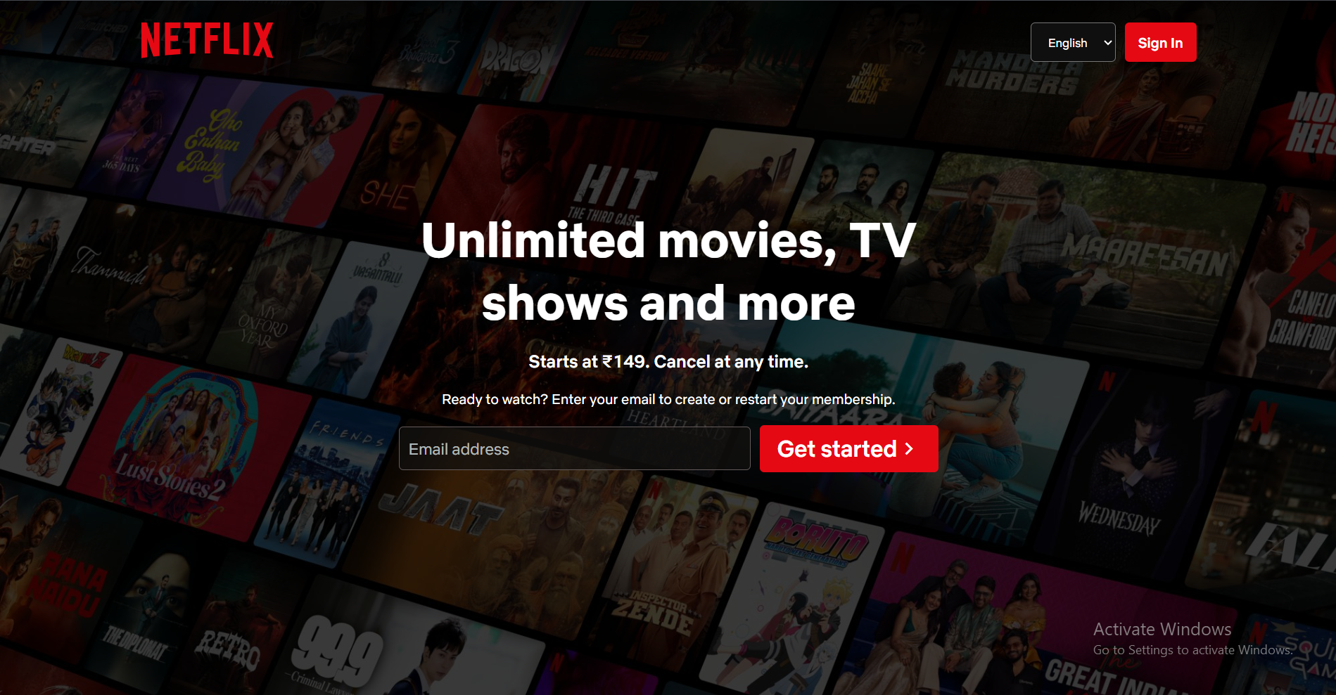
    Netflix Replica (HTML / CSS / Bootstrap)
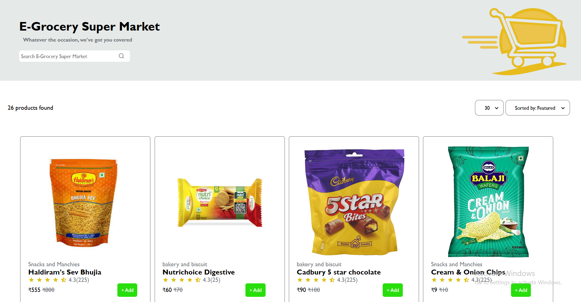
    E-Grocery Super Market (HTML / CSS)
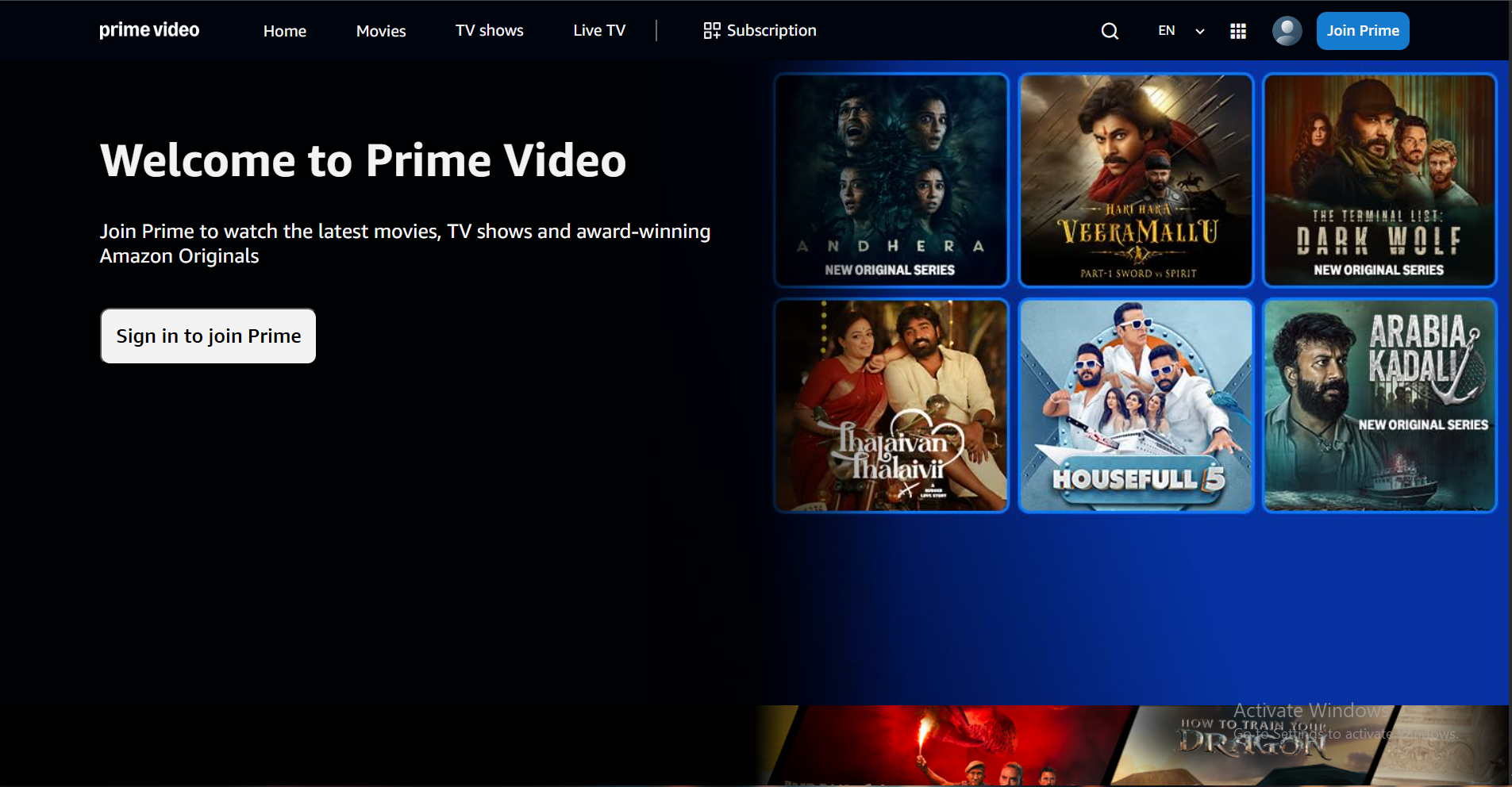
    PrimeVideos Replica (HTML / CSS)
    Doob Website (HTML / CSS / MQ)
    PeerInSync
    Frontend Part Handled by me

    Blogs

    rem vs em vs px — Which Unit Should You Use?
    What is Z-Index? Why Elements Overlap
    Flexbox: flex-grow & flex-shrink
    Deploying a HTML Website on GitHub Pages - Beginner Guide

    Testimonials

    Anant Shah

    Mentor

    “Dev consistently delivers high-quality work across all his projects. His attention to detail and ability to understand requirements quickly make him a reliable contributor to any technical task.”

    Stephani Tamakuvala

    Lecturer

    “Dev shows a great sense of responsibility. When he commits to a deadline, he makes sure the work is completed on time with proper quality.”

    Mithila Sompuera

    Lecturer

    “He communicates clearly and never hesitates to ask questions when needed. This quality helps him avoid mistakes and deliver better results.”

    Get In Touch

    ADDRESS

    Surat, Gujarat, India

    +91 9313059290

    devmahidara05@gmail.com

    SEND US NOTE

    Copyright © DM. All Rights Reserved.

    Terms & PolicyDisclaimer

    What is Z-Index? Why Elements Overlap

    Introduction

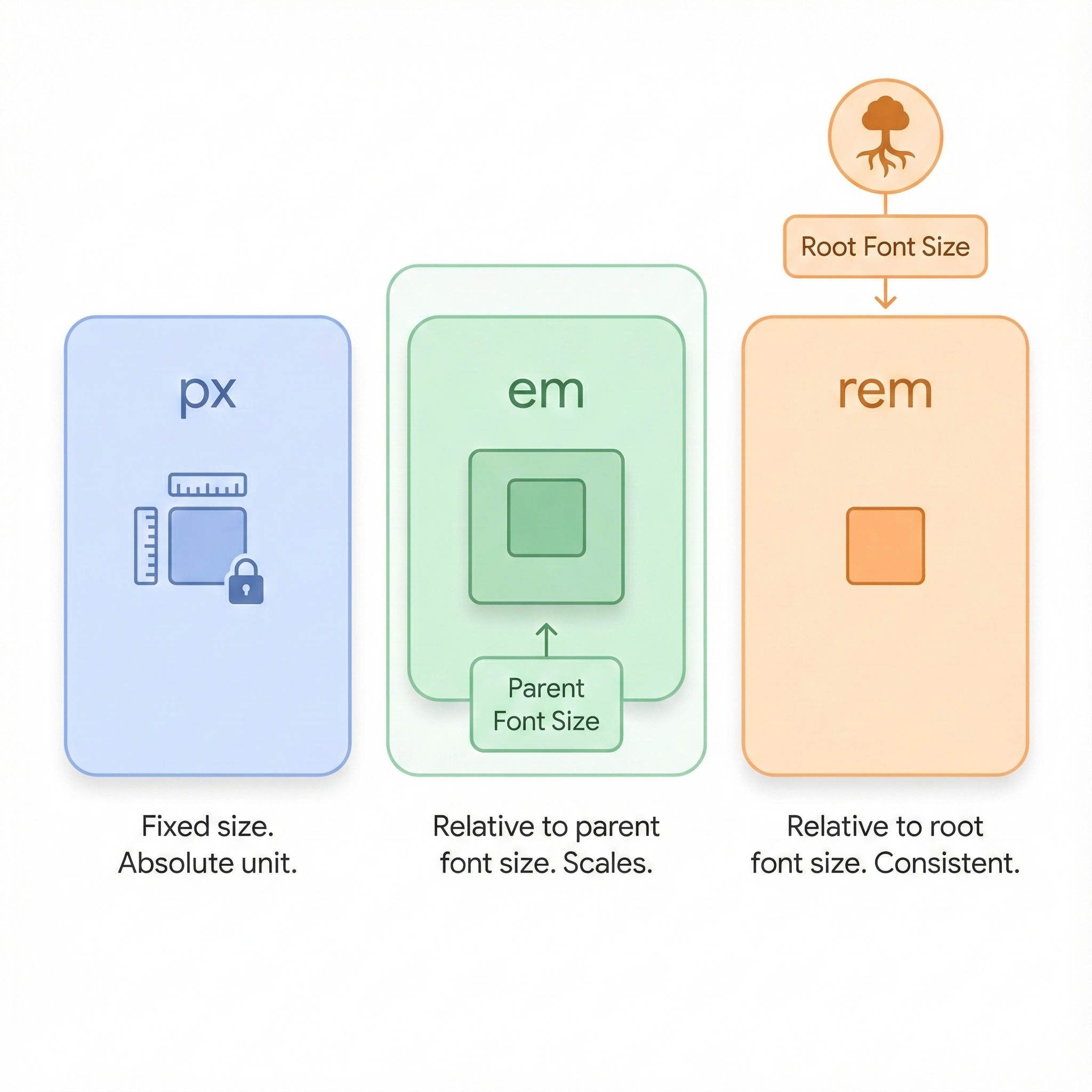
    In CSS, units decide how large text, spacing, or elements appear. The most commonly used units are px, em, and rem. They may look similar but behave very differently, especially in responsive design.

    1. px (Pixels)

    px is an absolute unit. It does not scale with screen size or parent font-size.

    When to use px:

    • Icons
    • Borders
    • Fixed-size UI elements

    Drawback: not very responsive.

    2. em

    em is a relative unit. It depends on the font-size of the parent element.

    Example behavior:

    
    /* If parent font-size = 20px */
    .child {
      font-size: 1.5em;  /* = 30px */
    }
      

    When to use em:

    • Padding and margin that scale with text
    • Components inside components

    Drawback: can “multiply” because it inherits from parent.

    3. rem (root em)

    rem is relative to the root html font-size, not the parent. This makes it predictable and perfect for responsive layouts.

    Example:

    
    /* If html font-size = 16px */
    .text {
      font-size: 2rem;  /* = 32px */
    }
      

    When to use rem:

    • Font sizes
    • Layout spacing
    • Responsive UI

    Developers prefer rem for its consistency.

    Quick Comparison

    • px → fixed size, does not scale
    • em → relative to parent font-size
    • rem → relative to root font-size

    Where You Use This in Real Projects

    In your portfolio, many text and spacing values would work better with rem because it scales consistently and avoids unexpected double-scaling that can happen with em.

    What is Z-Index? Why Elements Overlap

    Introduction

    In CSS, elements are usually arranged horizontally (X-axis) and vertically (Y-axis). But when elements overlap each other, we control their order using the Z-axis — the z-index property.

    Think of Z-index like layers:

    • Higher layer = visible on top
    • Lower layer = behind other elements

    What is z-index?

    z-index controls which element appears on top when elements overlap.

    Syntax:

    
    .element {
      position: relative;
      z-index: 10;
    }
      
    • A higher number = element comes to front
    • A lower number = element stays behind

    Example: z-index: 100 appears above z-index: 10

    Important Rule

    z-index works only when the element is positioned.

    It requires:

    • position: relative
    • position: absolute
    • position: fixed
    • position: sticky

    If the element has position: static (default), z-index won’t work.

    Why Elements Overlap

    Elements overlap when two positioned elements share the same space. For example, a button placed above an image, or a modal above the page.

    The browser needs to decide which one is above, so it uses the z-index order.

    Simple Example

    HTML:

    
    < div class="box red">< /div>
    < div class="box blue">< /div>
    

    CSS:

    
    .box {
    width: 150px;
    height: 150px;
    position: relative;
    }
    
    .red {
    background: red;
    z-index: 1;
    }
    
    .blue {
    background: blue;
    margin-left: 50px;
    z-index: 5;
    }
    

    Here:

    • Blue box overlaps red
    • Because 5 > 1

    Flexbox: flex-grow & flex-shrink

    Introduction

    Flexbox helps elements resize automatically based on the available space. Two important properties that control this behaviour are flex-grow and flex-shrink.

    • flex-grow → controls how much an item grows when there is extra space.
    • flex-shrink → controls how much an item shrinks when there is less space.

    Both of these only work inside a flex container (an element with display: flex).

    What is flex-grow?

    flex-grow decides how much a flex item expands when the container has extra free space. The value is a number (0, 1, 2, 3, …) that works like a ratio.

    Example:

    .box1{
        flex-grow: 1;
    }

    .box2{
        flex-grow: 2;
    }

    Here, Box 2 has flex-grow: 2 and Box 1 has flex-grow: 1. Total = 1 + 2 = 3 parts, so Box 2 becomes twice as wide as Box 1 (ratio 1 : 2).

    What is flex-shrink?

    flex-shrink decides how fast an item shrinks when there is not enough space in the container. The higher the value, the more that item will shrink compared to others.

    Example:

    .box1{
        flex-shrink: 1;
    }

    .box2{
        flex-shrink: 3;
    }

    When the container becomes smaller, Box 2 (flex-shrink: 3) shrinks 3 times faster than Box 1 (flex-shrink: 1). So Box 2 will become smaller earlier.

    Simple Flexbox Demo

    HTML:

    <div class="container">
        <div class="item a">A</div>
        <div class="item b">B</div>
    </div>

    CSS:

    .container{
        display: flex;
        width: 500px;
        border: 2px solid #ccc;
    }

    .a{
        flex-grow: 1;
        background: #fdebd0;
    }

    .b{
        flex-grow: 3;
        background: #fad7a0;
    }

    In this example, item B takes 3 parts and item A takes 1 part. So B always becomes wider than A (ratio 1 : 3), and both resize together when the container size changes.

    How I Used It in My Portfolio

    In my own portfolio website, I used Flexbox with Bootstrap utility classes to control how the layout behaves. The main page wrapper uses d-flex, and I applied flex-grow-1 on the main content area.

    Example from my code:

    <div class="app d-flex flex-nowrap">
        <aside class="side-header">...</aside>
        <div class="main-footer-wrapper flex-grow-1">...</div>
    </div>

    Here, the sidebar keeps its fixed width, and the main section (which contains my Swiper slider) uses flex-grow: 1 behind the scenes. This makes the main area expand to fill the remaining space on large screens and shrink smoothly on smaller screens.

    Even though I used Bootstrap utility classes, it is still just Flexbox: flex-grow decides how much space the main content takes compared to the sidebar.

    Deploying a HTML Website on GitHub Pages - Beginner Guide

    Introduction

    GitHub Pages is a free service that lets you host static websites directly from a GitHub repository. It's perfect for portfolios and small HTML/CSS/JS projects — no server or paid hosting required.

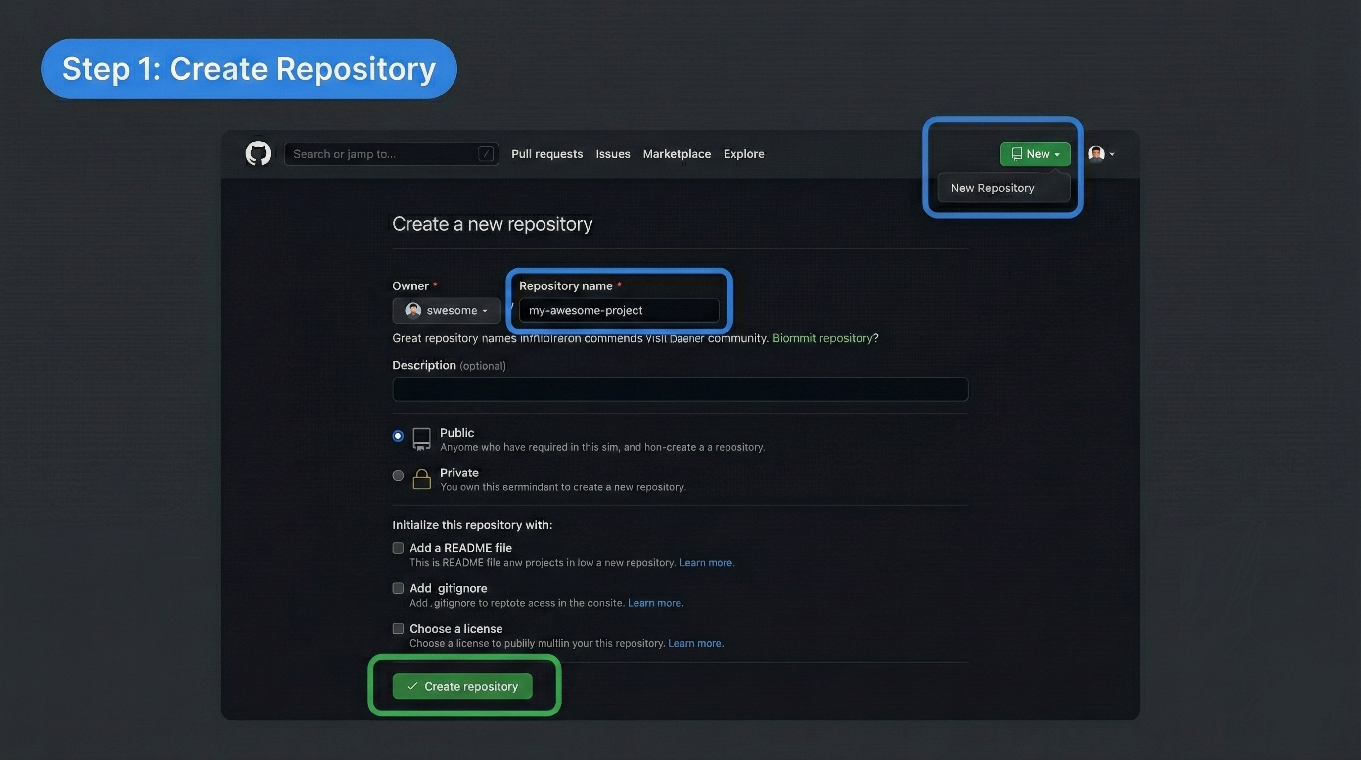
    Step 1: Create a Repository

    Create a new public repository on GitHub where your project files will live.

    • Go to github.com and sign in
    • Click New repository
    • Enter a repository name
    • Keep the repository Public
    • Click Create repository

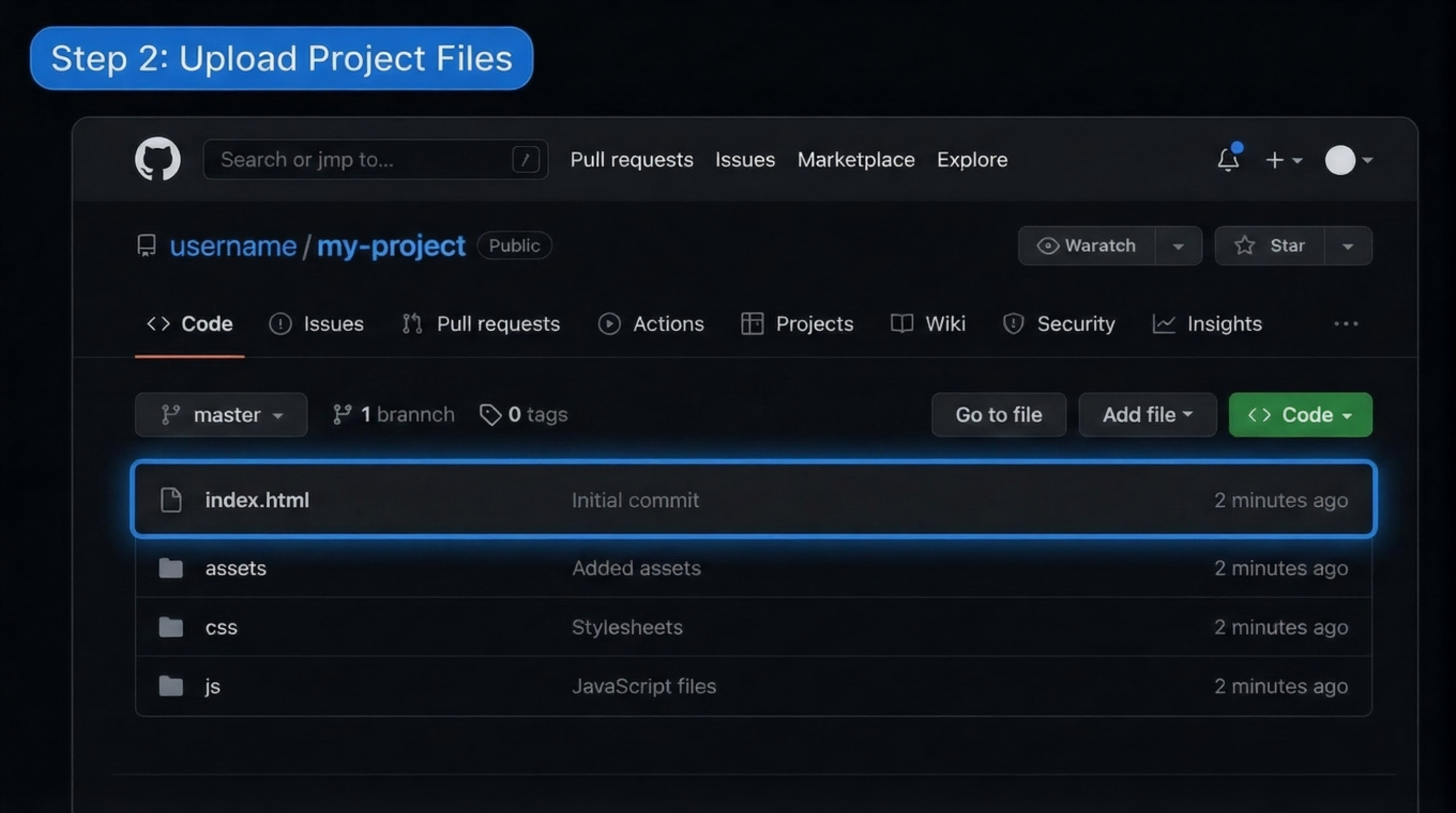
    Step 2: Add Your Project Files

    Upload your website files to the repository. Ensure your entry file is named index.html. A typical project structure looks like this:

    
    my-project/
      index.html
      assets/
        css/
        images/
      script.js
      

    Add any CSS, images, and JavaScript inside the repository so the site can load correctly.

    Step 3: Enable GitHub Pages

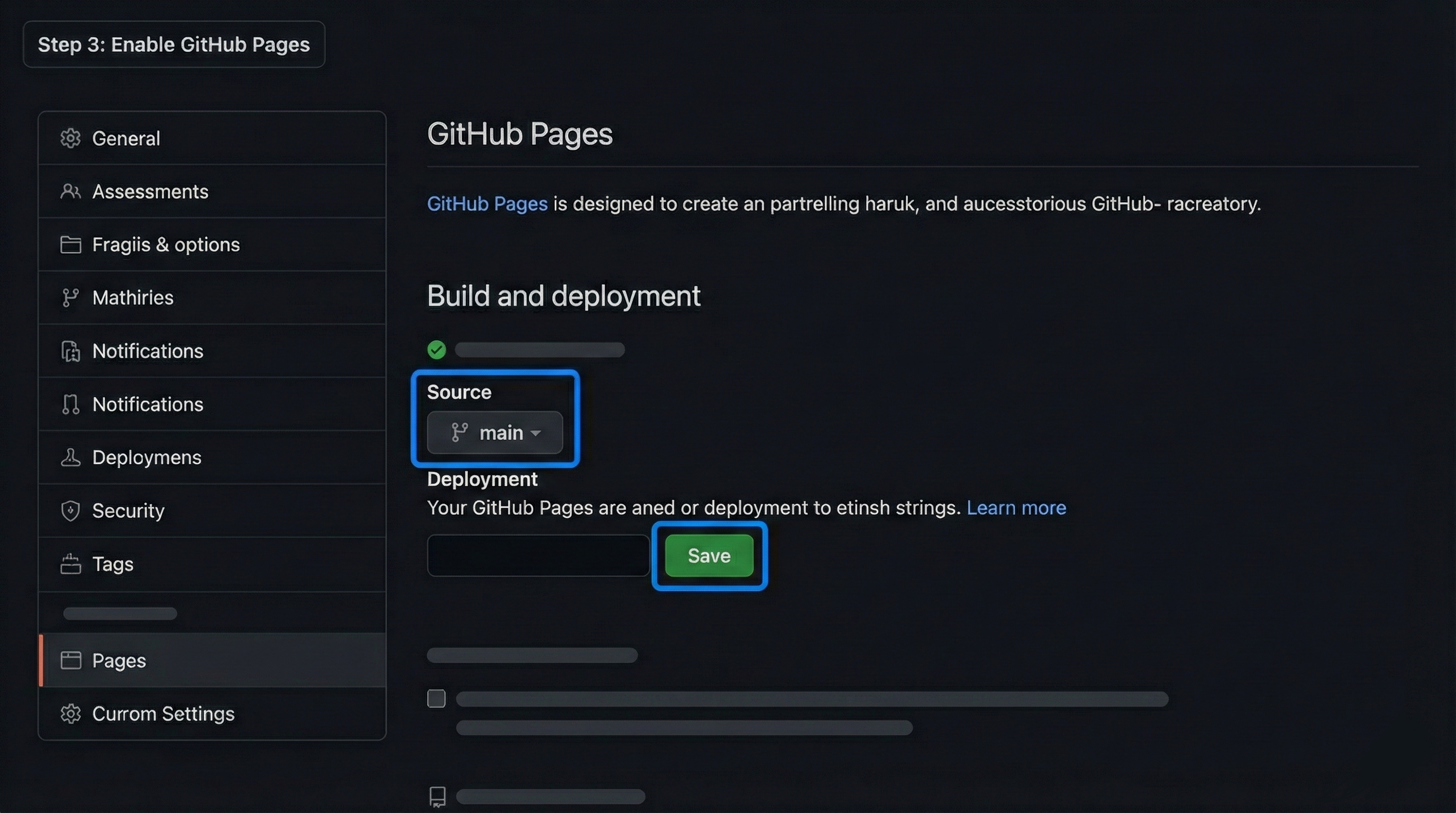
    Turn on GitHub Pages from your repository settings so GitHub serves your site.

    • Open your repository on GitHub
    • Click Settings
    • From the left menu, click Pages
    • Under Source, select the main branch
    • Choose the /root folder
    • Click Save

    GitHub Pages will start building your site immediately.

    github-iamges

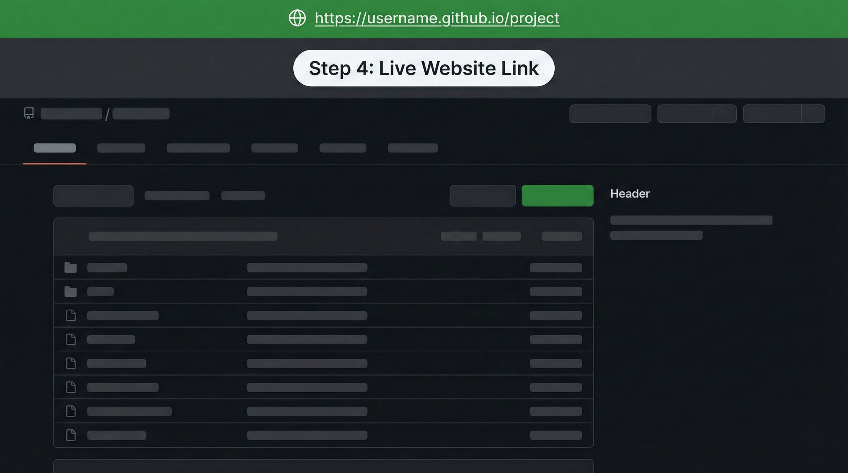
    Step 4: Get Your Website Link

    After a few seconds you’ll see a live link (green notification). It usually looks like:

    
    https://yourusername.github.io/repository-name
      

    Click the link to open your live website.

    github-link

    Step 5: Update Your Website

    To change your site later, edit files and push updates to the same repository. GitHub Pages will automatically rebuild and publish the latest version.

    Why GitHub Pages?

    • Free hosting for static sites
    • Easy to use with Git and GitHub
    • Perfect for portfolios, demos, and small projects
    • Supports custom domains if needed

    For a personal touch, add a short note like: “I host my portfolio and mini-projects on GitHub Pages to share work quickly and for free.”